Context
Front is a communication platform for teams helping customer-facing teams better interact with their customers across a variety of external communication tools
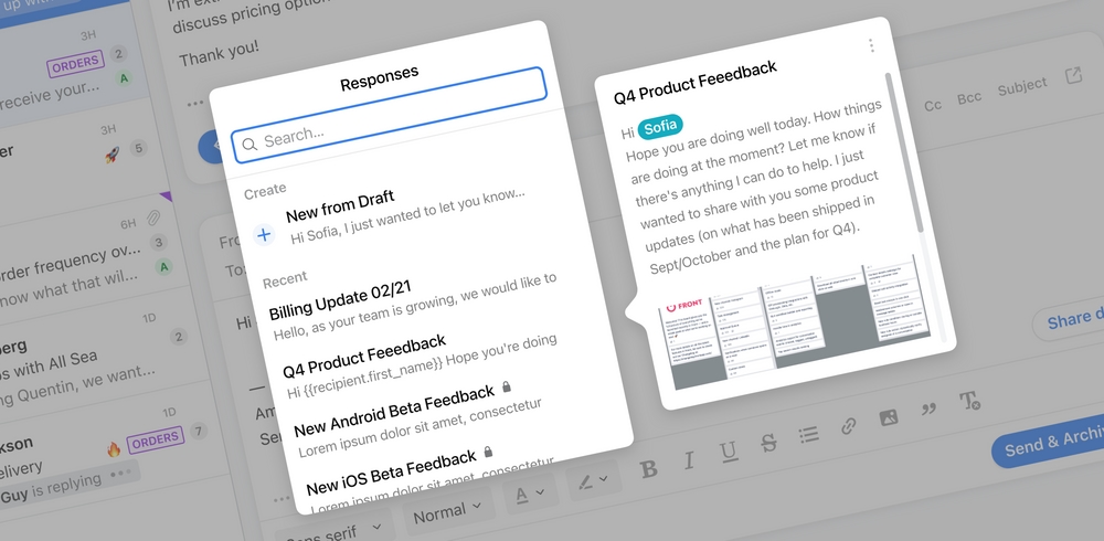
Front is a communication platform for teams helping customer-facing teams better interact with their customers across a variety of external communication tools
Responses are a powerful way of replying to messages in Front. It allows users to send saved responses, saving them time, and increasing the quality of their replies.
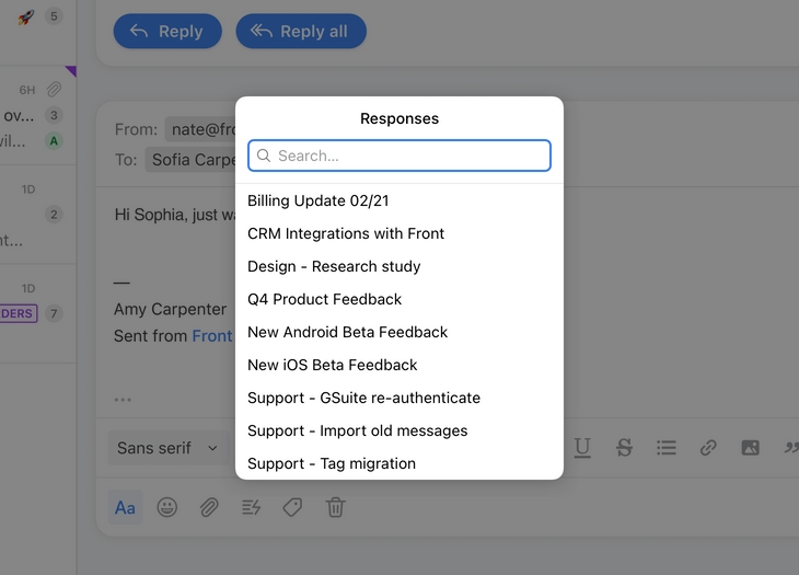
Usage of responses was low and users found it difficult to find and manage their personal and shared responses.
Over a couple of weeks, I worked on the wireframing of various explorations, conducted internal feedback sessions where I presented low-fidelity prototypes, and iterated on high-fidelity designs.
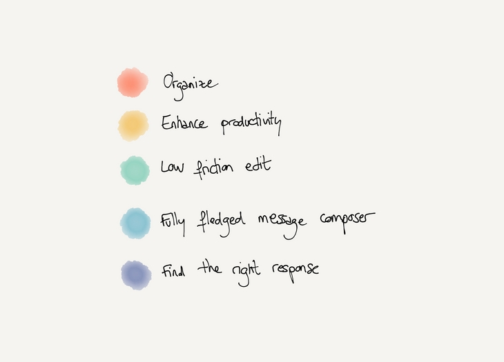
Based on the problem definition, we decided to focus on a few key areas:
As a secondary goal, we also decided to explore a few ideas on enhancing the productivity of users with new ways of surfacing responses.
To remove constraints related to the existing solution, we started from a blank page and decided to start iterating on a larger UI component to improve the functionalities of the response picker.
Relying on a larger UI component to improve the functionalities of the response picker.
The side navigation allows us to create multiple sections, making it easier for users to find the response they are looking for. The first section is a short list of the most frequently used responses, followed by the personal responses created by the user and the list of all the other responses available (categorized by team).
This exploration also incorporates some ideas from the Snippet exploration (more details below)
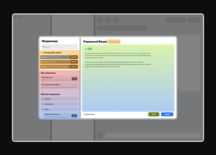
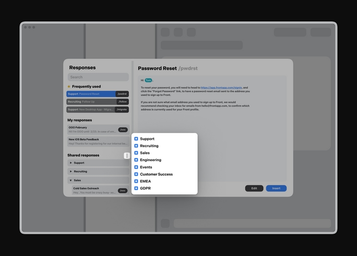
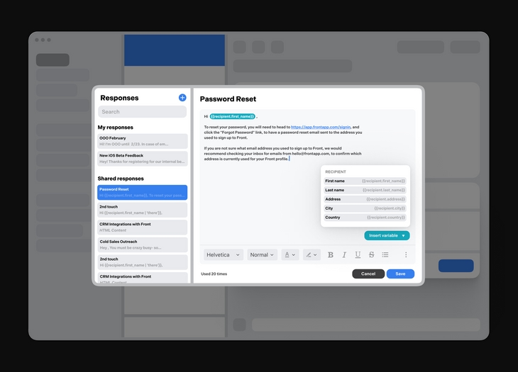
The larger message viewer/editor helps the user to get a full preview of the response, and can also surface entry points for variable insertion in responses. It also provides all the formatting options available in the regular message composer.
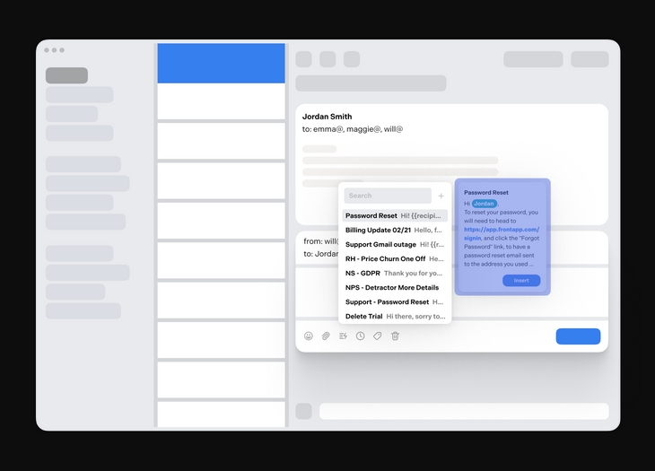
While the current implementation is limited in terms of features, we decided keep the current dropdown UI as a foundation and redesign it. The goal is to reduce the amount of new UI the user will need to relearn when we launch this project.
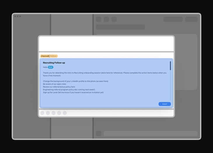
During interviews, I noticed how repeating tasks could be avoided by providing more advanced solutions to power users. Here the user is able to register frequently used responses and insert them directly into the message composer. As the user is typing their command, Front will try to match it to a corresponding response and display a preview of the message.
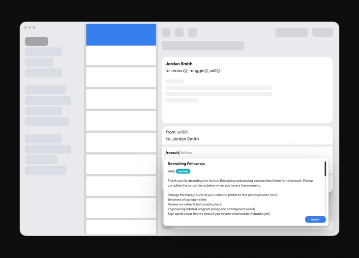
Snippets seemed like a good way to speed up the process of inserting a response and I wanted to go one step further in that direction. I explored a proactive solution that would provide recommendations to the user, based on the context of the conversation.
Instead of having to manually pick a response, Front will showcase a list of matching responses based on various criteria (emotions, topics, previous conversations...)
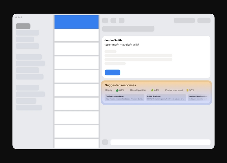
I had the opportunity to create a few interactive experiences based on the low fidelity explorations. Because of time constraints, I didn't have the chance to interview external users but I set up a few interviews with teammates from the sales, customer success, and support teams at Front.
Based on the feedback I collected, I was able to isolate recurring comments:
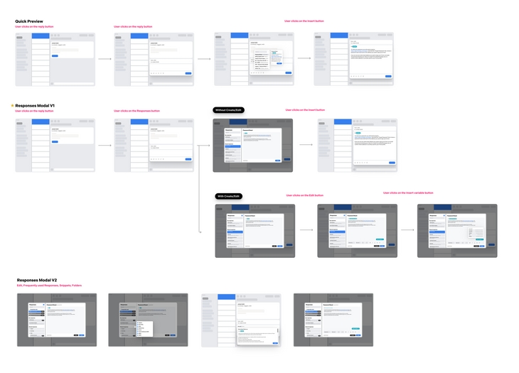
For the last round of iterations, we explored a concept that combined the lightness of the message preview concept and the flexibility offered by the modal. This concept is optimized for the recurring usage of a limited set of responses and provides an improved browsing experience.
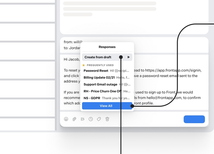
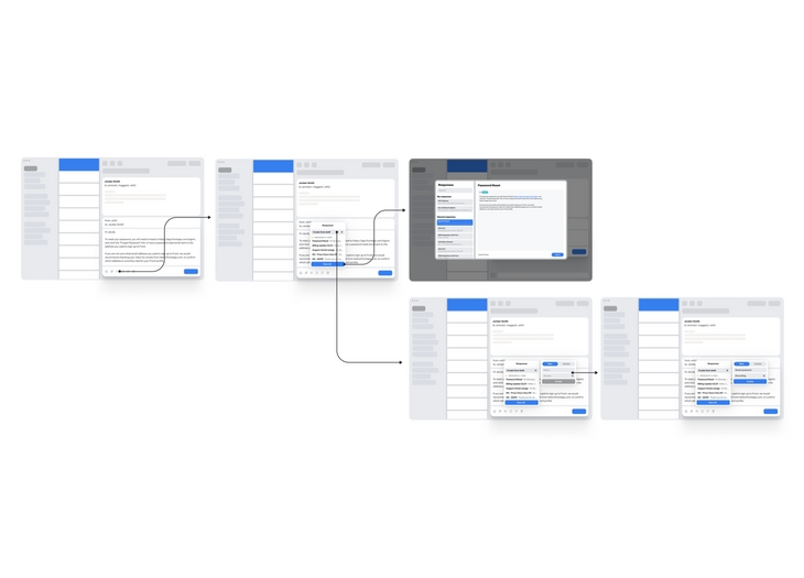
Based on the last feedback session, we decided to focus on the updated dropdown and message preview direction. We prioritized the lightness of the experience and made improvements to the existing solution instead of going with a brand new system (this allowed us to limit the scope of the project).
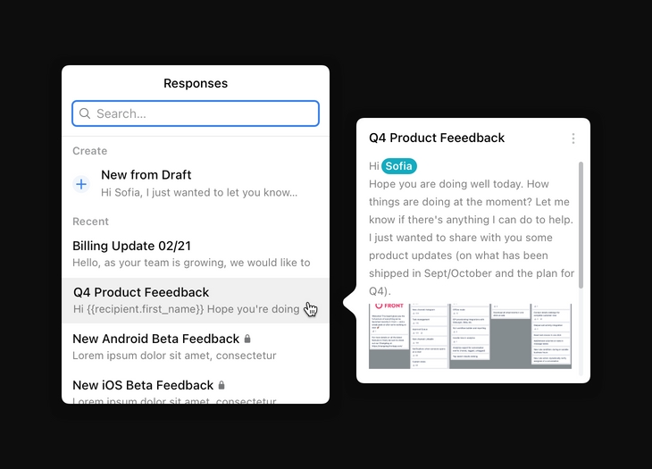
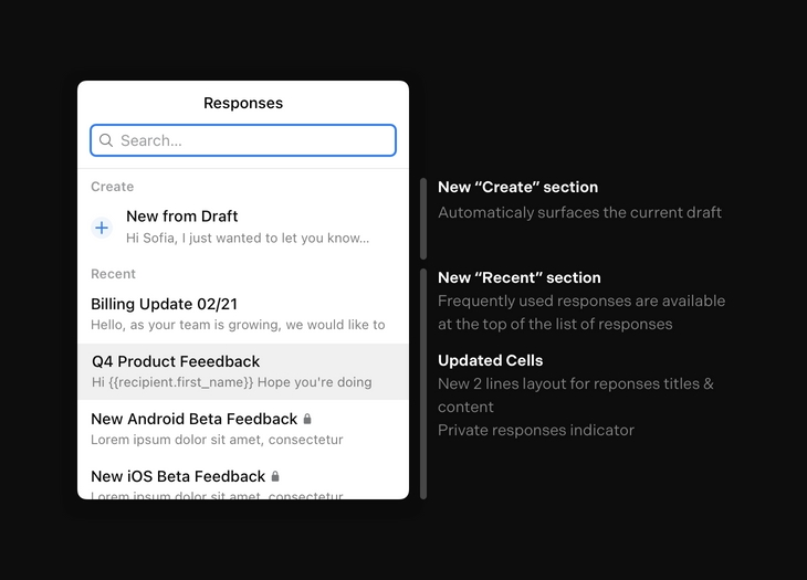
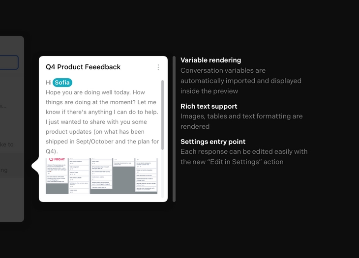
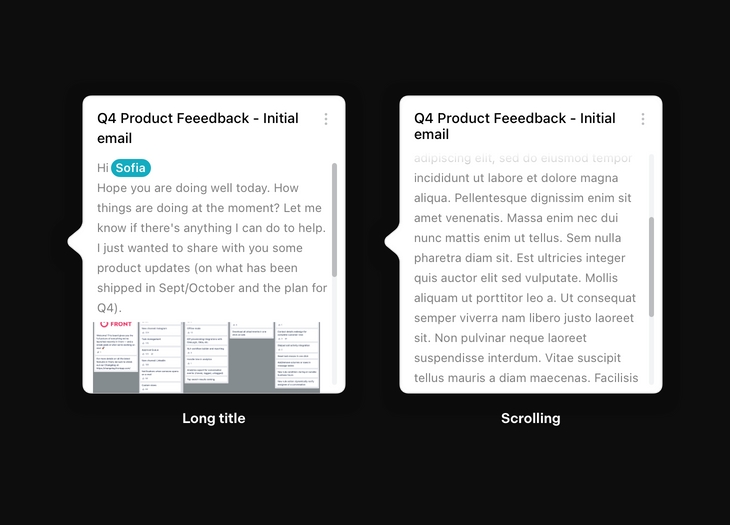
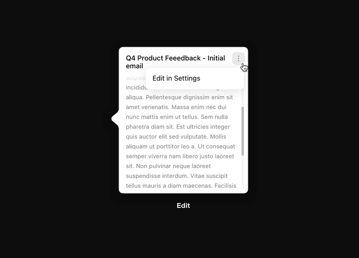
Feedback from users was very positive, and they specifically mentioned improvements around: