Context
Front is a communication platform for teams helping customer-facing teams better interact with their customers across a variety of external communication tools
Front is a communication platform for teams helping customer-facing teams better interact with their customers across a variety of external communication tools
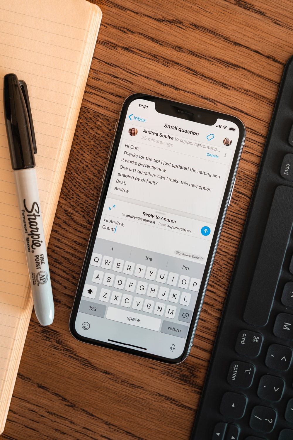
Front for iOS is the ideal companion to triage and reply to emails when you are on the go. With more and more Front users relying on it, we decided to revisit the composing experience. For this project, we focused on context and speed when replying to conversations.
Users were not able to get the full context of a conversation while replying to a message, increasing the time it took to reply and lowering the quality of the replies.
I worked closely with the iOS engineering team throughout the entire design progress, from the early ideation stage to the final implementation reviews.
Replying to a message can be straightforward, but sometimes it requires more effort.
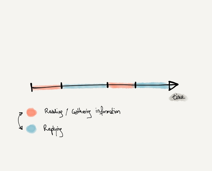
That’s why having access to the full history of a conversation can be helpful in a lot of situations. In Front, earlier messages, comments, and activities may all contain pertinent context. It became apparent that a user would need to read the conversation while composing a reply.
In the previous iteration, users had to follow a linear flow in order to reply to a message. This created 2 very distinct phases during the replying process:
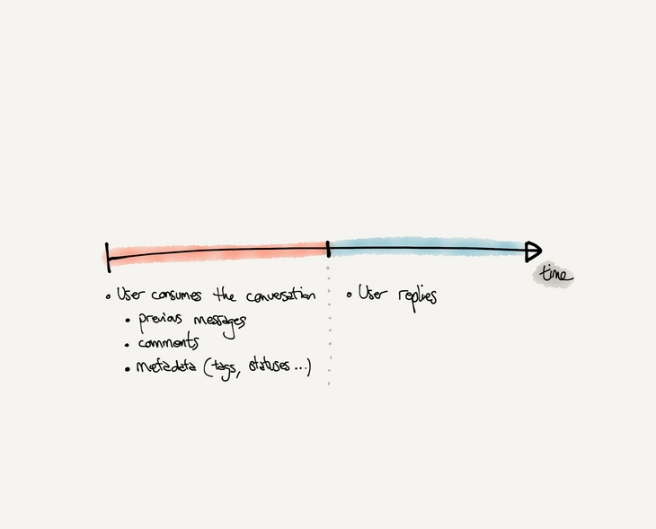
During the research phase, we realized how a lot of users had to navigate between the two screens in order to compose their reply, especially when confronted with:
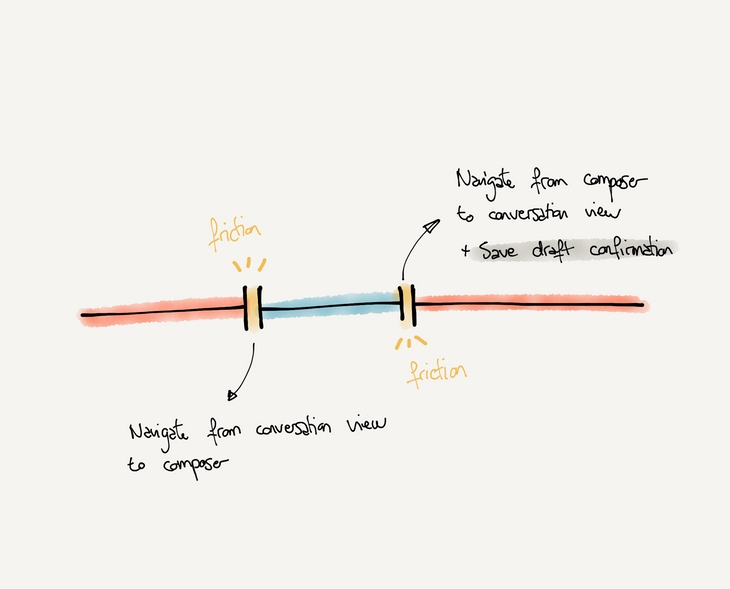
Research also allowed us to highlight friction points users were facing during the reply experience.
Based on the learnings for the research phase, we decided to focus on a fluid experience.
The new experience would need to reduce navigation transitions between screens and limit the number of user interactions needed to switch between the conversation and the composer.
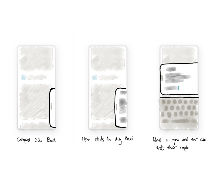
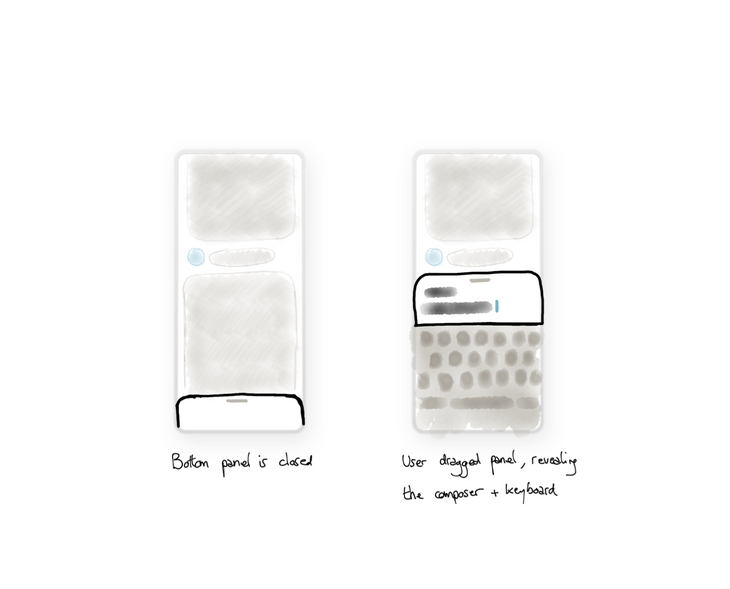
Two main explorations were considered at this stage of the project: a side panel & a bottom panel.
Both solutions allow the user to switch between the composer and the conversation from a single swipe, making the interaction seamless.
During the prototyping phase, we were able to identify key elements that allowed us to validate the exploration of the bottom bar:
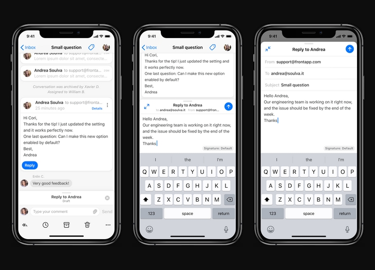
In addition to our main goal, we took this opportunity to also simplify and enhance the composing experience. By removing advanced features and focusing on the core experience, we were able to provide the right amount of flexibility at the right time without overwhelming the user. In order to build this new experience we focused on a multi states composer. Instead of having a single fullscreen experience for the composer, we decided to split it into 3 different states:
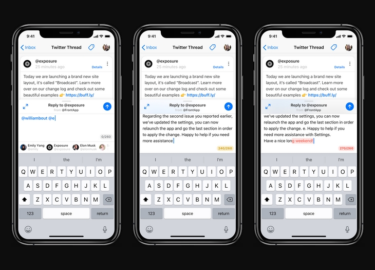
While a lot of conversations in the app are emails, Front supports a variety of different channel types. Facebook Messenger, Twitter, SMS, and others are available. This requires the composer to support additional features; providing an optimized experience for each channel. The Twitter composer provides a username autocomplete as well as a character count. The SMS composer displays a character counter. The SMS composer is displaying a SMS counter.
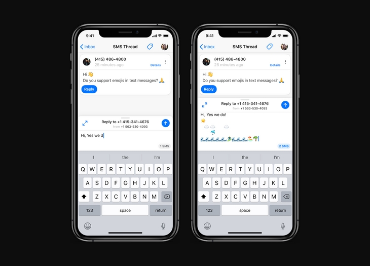
Some early explorations focused on a mini toolbar that could be used to provide more options to the composer. The initial mockups focused only on replying with text, and we also explored a small system with attachment management.
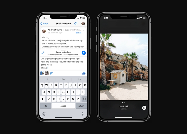
We ended up revisiting the signature UI and switched from a floating pill to a new action available in the mini toolbar.
We also designed an attachment viewer with the ability to see file name, file sizes and image previews.
After the release of this new composer, we measured the adoption of the new composer.
75% of our users rely on the new quick reply mode while 25% prefer to use the fullscreen mode.
This project was an opportunity for the design team to focus on providing a more adaptive experience in the app; allowing the user to choose the UI that matches their need, while offering more context enabling efficiency.